I’ve done gyms before in and around the hood, but this was a larger-than-life project which was to be the best equipped and largest gym for men and women for miles. I was called upon for the initial branding as well as most of the pre-opening signage and print. The main aim of the owner was to create a brand new spectacle to directly compete with existing establishments. Therefore, as ever, image and branding was taken care of first. The end chosen logo was a yellow bodybuilder’s sillouette with new-print text. The ‘bumble-bee’ theme was chosen for the colours.

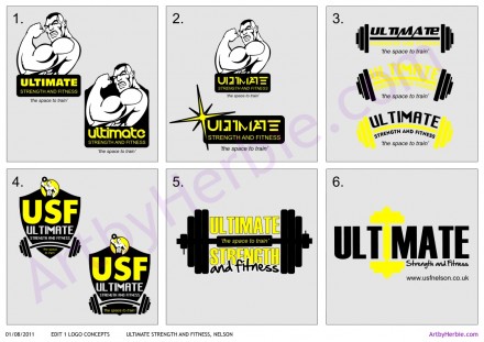
Sometimes as a designer, it’s difficult to convey the value and effectiveness of a design unless time has passed and that brand has been exposed to the public. At the time, the logo creation phase was a haggle between a few great concepts I designed but which could have been equally, if not more, effective. It’s great to show the ‘behind-the-scenes’ visuals of such projects so here’s an actual design-draft of the initial logo concepts at the time:
The artwork, fabrication and installation went smooth although the main 3m x 2m tray sign was a slight inconvenience to get up the scaffold because of windy conditions at the time However, it can be seen from the road leading to the gym so gives a great inviting vibe.
The gym is doing great and has been a real hit with the locals, it’s been a year and it’s still going strong so good luck to the next few! Here’s a few shots of the finished jobs.
[nggallery id=31]More major projects up soon, thanks for reading! Any comments and suggestions, feel free to fire away below!


