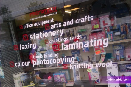
Microsoft Stationers, Nelson, Window Graphics – ArtbyHerbie.com
I did it about eighteen months ago but just thought it would be great to show as an early example of this design concept, which I enjoy using here and there amongst my artwork endeavours. It ALWAYS creates something fresh and bespoke, and the detailing is a further option.
It was fabricated as externally applied cast vinyl to the main window, which should be good for years to come. The outcome was that the road outside the stationers, had just re-opened to traffic after decades and created a good advertisement for the shop’s services as a new window installation.
Anyways, the client STILL loves it, after over a year of me doing it and that’s what matters, of course. It just happened that this particular design concept was used on a ‘pretty tricky’ cut-vinyl window installation with many small cuts, but it’s straight and central and not a single letter is wonky, so I’M happy with it.
Back to the grind, thanks for reading :)
PS: I’m still testing the facebook comments window below, feel free to comment if it works for you.

