
Banner Design
Just recently, a client who’s branding I had done earlier in the year returned to order some printed PVC banners measuring 4ft x 2ft. The branding was such that the imagery and fonts were always backed-up by a black background, to give that ‘dark and sophisticated’ look (get what I mean?). Not much of my large-format artwork consists of flat black backgrounds, but I still thought it was straightforward, to my surprise.
The banners were for an overseas charity project, for which my client is a supporter. The graphic design for the banner simply consisted of the black background, the logo and one line of white text reading ‘Supported and funded by’.
Large Format UV-LED Printing

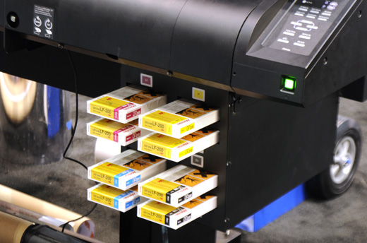
CMYK cartridges on a Mimaki
The Problem – When ‘Black’ Isn’t Really ‘Black'(!)
I exported the design as a pdf at 300dpi resolution, and viewed it in Adobe Reader 9.3, it looked fine and the black background seemed really err…black? It looked good. PDF documents are an industry standard type of print-ready file because they hold their resolution and also use the CMYK colour model, which is a popular commercial printing colour model. CMYK is what most printers and commercial-printing set-ups use, which consists of four inks, cyan, magenta, yellow and key (black), which are used in various techniques, to generate millions of other colours and print the artwork.
When the artwork was printed onto the PVC banner material, the print came out such that the flat black background didn’t look black, but more of a ‘dark grey’ or ‘anthracite’ colour. I initially thought it was the printer that fucked up, but these things rarely go wrong so i suspected it was an artwork issue. Photos don’t differentiate in much detail, view the photo below to get my shizzle(!)

Black or Dark Grey? (FYI this is the first 'nearly black' effort)
The Solution – CMYK vs HSV/RGB
I researched around some online forums and blogs, and found the solution to my problem. The problem existed because different colour models interpret flat colours in varying ways. Let me explain. When designing using my vector graphics software, all colours on the screen are viewed and represented using the HSV colour model, which allocates a six-digit code to each colour/shade such as #FF80FE (a glorious shade of pink!). This colour model uses light to generate the different colours on your monitor’s screen, and so are great for web-design and web-graphics.
However, the standard black in the HSV model is represented by #000000, but it’s CMYK equivalent is the ‘dark grey’ black. Yes, it looks fine on the screen, but when converted to CMYK for printing, the various ink mixtures result in the ‘not-so-black’ black(!) #000000 actually converts to C-0% M-0% Y-0% K-100%, which is also referred to as ‘100% black’ because it is 100% of the ‘Key’ black ink which is used.
I was advised to increase the percentages a little on the other three inks. The reasoning behind this is far too complex for a short-ish post on my blog, but it’s related to the way the inks are mixed to generate other colours. I increased the percentages of the other three inks, to create a ‘new colour’ in my graphics software. I opted for C-25% M-25% Y-25% K-100% and used this black instead of the standard black. It still looked the same on my screen, but when printed it was a beautiful, rich ‘darker-than-dark’ black. A huge improvement, and a lesson learned for me. (I don’t have a photo of the improved print because I had to post it out same-day, but it was blacker than black and made the text and font stand out even better). Whooppee!
If you’re a designer, printer or related professional, let me know of any similar problems you’ve had and how you rectified them. If you’re a potential customer, don’t worry, not all my jobs are fuck-ups, this was just a little ‘grey area’ in my skills-set(!)
Just found this post and it’s really helped me. I had exactly the same problem with a client and have another black banner to produce today, so will follow your advice. Thanks!
thanks sara, good lu8ck with your re-print today, remember to add extra values to the CMY colours whilst keeping 100% on the key colour. C35 M35 Y35 K100, seems a lot better than when I wrote this article. let me know how you get on.
Valuable info for those starting out in large format print, i learned the hard way too after printing out a huuuge banner with the same black problem. Lucky me I found your site by accident, I bookmarked it. Thanks
thanks george! it cost me a re-print too but hey, if quality is guaranteed…
no probs lora, glad it helped and as goes for my writing style, im just being me! much love
It took me a while to search on the net about this problem because my prints were coming out wrong but your explanation about the hsv/cmyk differences solved it, i checked ‘print colours’ in illustrator and can now view the differentce in print and screen colours, i love the way you explain things by being yourself, bookmarked and thanks again.
– Lora
just sent you a message on facebook, please reply asap :)