
If you’re in business, big or small, a business card is the first step to promotion. It acts as a constant reminder of you, your organisation and your product/service which somebody can take away with them and refer to as and when required. Therefore, they have to be shit-hot, or they’ll get tossed amongst all the other business cards one accumulates.
I just can’t understand why people use FREE web services such as Vistaprint who send you 250 ‘free’ cards printed on shit paper with artwork that consists of selecting elements such as text, colours and images from a drop-down menu on-screen (no offence VP). Why would you want to hand these out to prospective customers with ‘Printed FREE at Vistaprint’ plastered on the back? What’s wrong with you?
Then there’s them cheap cardboard cards available to purchase from a big red machine in shopping centres. These should be illegal as the laughable fonts, 90s’ clip-arts and ‘border-designs’ can really cause damage to your business rep(!)
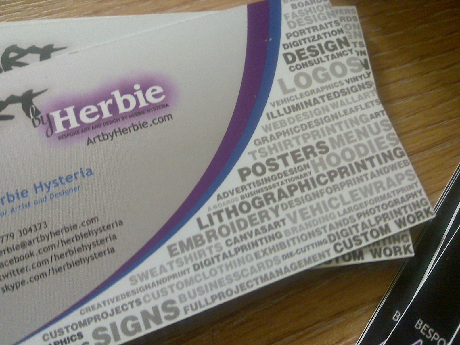
My new ones arrived this morning printed on 400gsm matt-laminated paper. I think I deserve a bucketload of gold nuggets for cramming the most info onto a business card CREATIVELY, but even then it’s only one-half of one side used. I went for a landscape design on one side and a portrait design with my ‘face’ logo on the other, just to keep things spicy(!)

Front and back

Did I leave anything out?
Quality business cards can get costly, but keeping everything in mind, I recommend 400gsm matt/gloss-laminated. Quality feel, finish and functionality at an affordable price. That’s it, you won’t have to contemplate a re-mortgage and/or bank robbery(!) Matt lamination is a thin film added to the card which protects the card from wear and tear, spillages and lasts a lot longer. Gloss-lamination achieves the same purpose but has a shinier ‘sheen’ to the finish.
In my opinion, the ONLY way to go is get your cards designed full-colour, professionally. Either do it yourself or get someone with sick skills like me to do it, and printed on a thick card with a smooth finish. OK, the actual cost of the artwork/print is higher initially, but the image you will portray for yourself is surely priceless, right? Your new business cards should last you months, even years, so you’ll have to live with your shit design if you choose that road(!)
Prices are as follows:
[table id=17 /]
So, as you can see, it’s not rocket science, ‘spend your money but spend it wisely’ my old man says(!) If you’re looking for business cards, get in touch!
PS: Facebook fans who have ‘liked’ my page get a further discount, enough to buy you a drink on me, or a sandwich on me, whatever tickles yer pickle. Click ‘Like’ in the right side-bar >>.
PPS: More portfolio updates soon.
As Delboy Trotter would say, ‘Bonjour!’.
I’m afraid I’ve got to disagree about those cards of yours, Herbie.
Firstly, the mass of fonted information on the face of the card makes it impossible to scan and OCR using a business card scanner. It will have to be entered manually into its recipient’s CRM system – and anything that makes a prospective client have to go to extra effort makes it less likely that they will, and leaves at least one person in the company grumpy about you.
Secondly, the solid black reverse of the card means that unless they’re carrying a fine-tip metallic Sharpie with them, those prospective clients aren’t going to be able to make notes about you. Those notes tell their PAs what you’re about (granted, you’ve covered that…completely), and what to do about you.
Thirdly, even if you’d left note-taking space on the reverse, matt lamination means we’re back in Sharpie territory if they’re to leave anything more readable than a smear of Biro ink.
It’s contentious, I know, but I firmly believe that the face of the card is where to put all the contact information. It shouldn’t have a background graphic, because they confuse business card scanners. The font should be conventional serif or sans-serif, not a fancy script or graphic face. It should have a clear, high contrast differential between font and background – and that’s not just for the scanners: the people controlling the big money are at the age where their eyes are starting to lose depth of focus. Make it so they can read the card without needing their glasses, and they’ll like you better.
It’s the rear of the card that should have the what-you’re-about details – and still leave a reasonably-sized space for handwritten comments. The face can be UV coated or laminated, but the back shouldn’t be.
The thing is this – and you’re getting this from someone who’s been CEO of six businesses to date, and has a printing background, both personally and family – the business card isn’t there to puff your ego, it’s to put your contact details in the hands of people with whom you’re hoping to do business. Every small thing that puts a barrier in the way of that is going against the whole point of business cards. There’s still scope for originality and cool design (remember Zuckerberg’s “I’m the CEO…bitch!”?), but within parameters that don’t break the whole point of the cards.
We don’t see what happens to our own cards after we’ve given them out, but I do see what happens to the ones I and colleagues get. Cards that make it difficult or inconvenient to process them, or where I’ve forgotten why I exchanged cards because I couldn’t make a note on it, often get dropped in the “round file” by the side of my desk.
HI jon, first of all thanks for the detailed and sensible explanation of your views of my card. I do agree with you on some aspects such as clarity, spacing, blank space etc, but the whole concept of this card design was to creatively show an exhaustive list of my services on an 85mm x 55mm card.
In regards to the font all my onlinr branding, prose and graphics uses ‘Trebuchet MS’ as both a readable and web-friendly font. In regards to the ‘OTT’ design you may see, that is what I pride myself on and wanted my card as a reflection of good design. I’m actually through the process of re-designing my cards so will definately take some of your points on board.
Thanks, hope you keep treading my blog and Facebook page. :)