Client Repeats!
A few months ago, I designed and printed the folded-A4 menus for a local takeaway in my neighbourhood. Back then, it was a completely fresh design and branding for the new owners of the business, who loved it and gave me a cart-load of ‘pats on the back’ as a result (I still have a sore back!). Anyways, during the run-up to Christmas 2010, they re-approached me to update the menu, this time making it ‘Christmassy’ (if that’s a word).
The basic design (fonts, imagery, positioning, colours etc) was to remain the same, whilst the design-concept required a re-fresh to bring it up-to-date. Also, a few other little changes were done at the same time such as additional menu items and minor-tweaks here and there.
The Original Design
The design was originally a totally new design for the business, which served traditional Asian food as well as fast-food such as burgers and pizzas. The design was kept ‘light-hearted’ and ‘informal’ and their new logo consisted of a cartoon mascot on a branded-moped travelling at speed (to convey the idea of a quick delivery service).
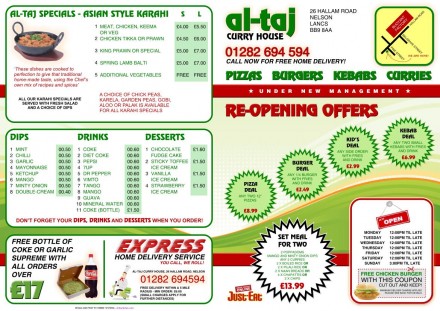
Al-Taj Original Menu - Front and Back
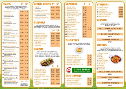
Al-Taj Original Menu - Middle
The name itself, ‘Al-Taj’ sends sub-conscious depictions of the sub-continent and ethnic culture. So, in making the design more ‘cartoonish’ and informal, it was definately a thought ‘outside-of-the-box’ for me(!)
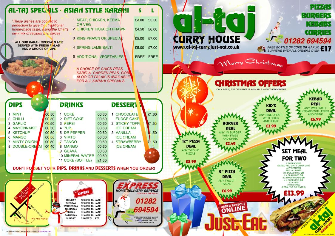
The Christmas Re-Design
Their 2010 christmas re-design also gave me an opportunity to position things more efficiently and better-fit elements such as opening times and the map of the premises. Alterations included included:
- increased logo size on front
- added coverings of snow to the logo
- added a main ‘Merry Christmas’ ribbon
- added a background picture to the ‘Al-Taj Specials’ section
- added a cartoon winter-night background picture
- added wrapped-presents
- added flowing ribbons and bobbles
- added detailed stars and snowflakes sprinkled around the menu
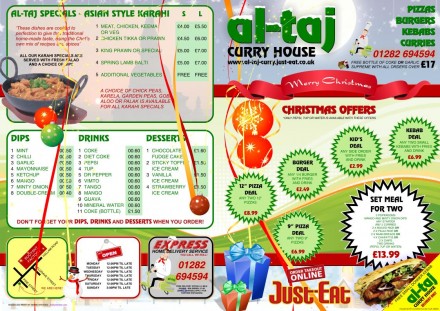
Al-Taj Christmas Menu - Front and Back
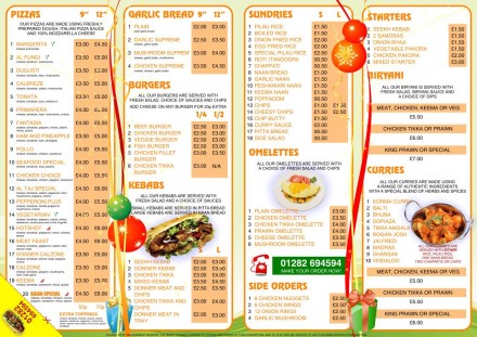
Al-Taj Christmas Menu - Middle
The vector ribbons and christmas-tree bobbles I added were positioned so they crossed the entire width of the menus, so they had to go over the ‘bleed area’ of the document at design-stage. However, it wasn’t just a case of stretching the vector shapes and being done with it, each and every ribbon and bobble/element is strategically positioned so that they do not interfere with the menu items and the prices. Design is everything, yes, but it’s not everything when it’s covering the prices of your food items on your menu! So, you’ll notice the paths the ribbons take are very specific, sometimes even BETWEEN letters and words!
I also took this opportunity to increase the size of the ‘Just-Eat’ logo, at the request of the management. Apparently, more and more people are ordering their food from the online service.
A few other things got moved around and the menu’s ‘Free Chicken Burger’ voucher was re-designed so that customers could tear it off from the corner whilst not destroying the menu(!) As usual, the customers and the management loved the results and at the moment, it is THE best Christmas menu doing the rounds in my neighbourhood. Yee-ha!
Anyways, there’s a seat with my name on it for a big feast today (Christmas Day), better not let that seat get stolen!
Christmas Mubarak everyone!


Great info about takeaway menus. Nice one
They’re a headache to design first-time, so much detail like categories, dishes, portions, prices….