
Intro
These are six fonts I have decided to remove from my computer because I think they can be easily replaced by more modern types, or they’re too overused to be involved in my design work. Either way, these are the more notorious ones. No doubt there exist some absolutely idiotic and ugly fonts too. For now, these are the ones I’m sure you’ve heard of before. I’ll also suggest some possible alternatives.
As a graphic designer, I have over 4,500 carefully selected and tweaked fonts in my windows fonts folder. This is so that they are always available in all the various software and programs I use to design and edit. Fonts and typography are one of THE most important aspects of any graphic design, logo, branding or web design work. I generally begin with the font as the first stepping-stone to any new piece of design work. However, there are some culprits which I think have been over-used, abused and are just not worthy of having a coveted place in my windows Fonts folder anymore:
1. Comic Sans

Making things too 'jolly' - Comic Sans
Over the last sixteen years, it has been mis-used in everything from restaurant signage, corporate documents and even warning signs! Moreso, in memos, documents, newsletters and emails which is supposed to look professional, yet end up looking completely the opposite. I would say anyone who uses this font in anything but a comic-book, its initial intended use, is an amateur, at the least.
It’s use instantly changes the mood of a document or design from ‘serious/formal’ to a more light-hearted and ‘silly’ mood. Clueless office execs have been using this font to ‘tone down’ their spontaneous A4-sized warning messages for years. Probably to appear more ‘whimsical’ and ‘fun’. Pffft! To me, it just shouts ‘Don’t take me seriously, please!’.
There’s even a campaign, started in 1999, called ‘Ban Comic Sans’. It was started in USA by two graphic designers called Dave and Holly Combs. It was a reaction to the widespread disgruntlement amongst design professionals regarding the use of the font. Eleven years on, and with further notoriety, their website is still going strong. You can see their website here.
ALTERNATIVES:
Helvetica – for formal / serious messages
Courier Sans – for a direct replacement in children’s design and comic books
2. Papyrus

Loved by James Cameron himself.
Just recently, James Cameron’s blockbuster movie ‘Avatar’ used the Papyrus font, or a very close variation of it, to display subtitles spoken by the Na’vi, the alien protagonists of the film. Just one question, James. Why? With a multi-million dollar budget, cutting-edge technology and amazing 3D effects, why did you have to go and spoil it all by using a font that has come free with PCs since the early 90s?
Again, as Comic Sans above, there is a campaign to highlight the dire overuse of this font. PapyrusWatch.com is an online petition to showcase and document the overuse of this font in many installations such as print, graphics and web.
ALTERNATIVES:
Kigali – to keep the exotic and fantasy look
Plato – very similar looking but less detailing
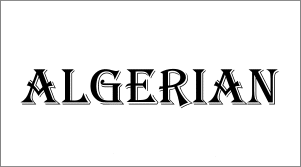
3. Algerian

Algerian - a bit TOO vintage now.
I suppose it could be OK in some instances such as work depicting the Victorian and pre-industrial-revolution eras, but the fact that it is everywhere doesn’t say much about your creativity. A favourite with sign-makers, it’s usually seen in bigger sizes and in shop-windows. I’ve seen a local barber in Lancashire who’s window price-list has been created completely in Algerian. To protect the barber from a severe backlash, I won’t include a picture in this post.
ALTERNATIVES:
Tangiers – same effect but without the blocks and indents that Algerian is known for
Albania – similar to Algerian but not identical
4. Arial

Even the mighty 'Arial' has got to go now.
Recently, it has been replaced by Helvetica as the standard choice for graphic designers and design professionals. Even this transition is well known amongst the profession. For these reasons, I think my use of Arial will be very rare, also.
ALTERNATIVES:
Helvetica – for formal or design work
Futura – great replacement in design for print
5. Cooper Black

Since 1921.
I think it’s prime use today should be on greetings cards and party invites. Certainly not in a formal application. You just can’t take anything serious if it’s adorned with this font. I can just imagine it on balloons and posters promoting the village market, designed by the village postmaster on Microsoft Publisher(!) I’m sure you get my drift.
ALTERNATIVES:
Adera SSK – more consistently rounded ‘bubble’ type letters
AdLib – squared letters instead of curved
6. Brushscript MT

No, it doesn't make you look like an 'Artist'
You see, why do a lot of amateurs and hobbyists use this font to convey an ‘art’, ‘artist’, ‘artistic’ kind of message? Is it because of the name of the font which has the word ‘brush’ in it that people tend to sub-consciously lean towards this font? Or is it because they think it looks like the handwriting of an artist done using a paintbrush? Hmm, either way, it’s instantly recognisable as ‘that font’ so it’s going. There. Gone.
ALTERNATIVES:
Vitrina – gives the same feeling with a little more ‘flair’
Pooper Black – same ‘brush’ effect but more contemporary
Bello – cleaner and more readable
Other Fonts That May Get ‘The Chop’
The above are my top six fonts which will definately have no place in my collection anymore. There’s a few more which managed to escape my wrath by a whisker. These are Curlz MT, Lucida Handwriting and also Copperplate Gothic. In my opinion, graphic design is all about being creative and original. Therefore, using typefaces which people have seen ‘used and abused’ doesn’t really help the originality.
I’m not the world’s greatest expert on typography, but it’s something I take a deep interest in. Let me know what your thoughts are or if there’s any fonts you think I missed. What’s your most-hated font? Leave a comment and let me know.
Just fbooked to an old friend’s college post.. That’s Cooper Black….. Used on Dad’s army and bea h boys pet sounds. For a retro feel.
Used everywhere now! Do they know why I wonder
Yeah, it just sceams ‘1990s’ to me. I can remember when the first vinyl cutter / plotters came out in the 80s. The limitation of fonts meant this one was overused on signage everywhere LOL
Cooper Black is an evergreen. Unlike Arial or Comic Sans, it’s not that widely used, also exhibits a lot of elegance.
However, I miss the Times New Roman from the list… Come on, this font is a troll. Even the browsers display the content with TNR when no styles are defined… Dumb users typing their Word documents will let TNR as default.
Another troll is Courier New.
LOL! So sorry I missed your comment. Totally agree about TNR, it’s a default level of absolute amateurism haha
It’s posts like this that keep me coming back and checking this site regularly, thanks for the info!
Thanks, Derek. Nine years later I reply to you but better late than never, eh? LOL
lol Tiana i used to recognise comic sans in my school -years ago, the admin staff would use it when sending out memos to other teachers, it just made my teachers look less educated than the students lol
so you’re a comic creator? sounds great and you’re right, blambot looks waaaay better, i think overuse of a font makes our subconscious wary and susceptible to identifying these fots everywhere we go
thanks for the great reply!
I have to agree with every single one of your font choices. The only one which hasn’t got the chop on my computer is Arial… it would muck with some programs, unfortunately. Comic Sans bit the dust as soon as I installed Windows this go-round.
But! Comic Sans has no place in a comic book EVER. Wander over to a comic community or two and you’ll discover that we comic creators absolutely despise the font and make fun of anyone who uses it seriously in a comic. There are much better alternatives, and I don’t feel your recommendations for Comic Sans alternatives hold up. I personally would recommend any of the comic fonts from Blambot as a good comic book alternative… Mighty Zeo is my favorite, but all of them are great and many times better than Comic Sans.
Comic Sans definately tops my list for hated fonts, but I admit a certain degree of loathing for Lucidia Handwriting, Brush Script, and Papyrus… and Copperplate Gothic… and Curlz… hm, it seems we share similar font dislikes. I find anything that uses a Windows default font just looks, well, unprofessional to me. Like they were too cheap to buy a better, less used font.
Great post.
your wit shines through in your posts, carry on blogging!
LOl, nine years late in replying but thanks for the heads-up!