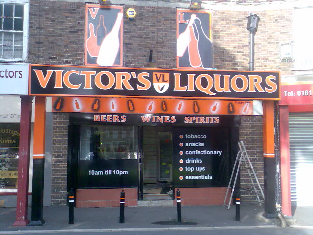

The finished article - slicker than your average!
Victor’s Liquors is a new off license and liquor store in Sale, Manchester. In the summer of 2009, I was approached by the owner to manage the whole project and get the store ready for it’s opening in August, 2009.
The Brief – ‘The Best Dressed Off License In Manchester’

Herbie Hysteria and Victor Victorious

The state of the shop, before the fun began
Logo Design and Branding

Victor's Liquors Logo
I chose two typefaces for the whole project. The main font used in the logo is called Anticlaire Display SSK, a personal favourite of mine. I think it’s clarity and elegance worked well whilst remaining simple and readable. I stuck with normal Arial to be used on information such as products, opening times and such.
Painting and Colour-Coordination (RAL)
Picking the correct shade of orange was extremely important. This is because the orange had to be exactly the same colour for the paint as well as the vinyls. I started by viewing all the possible orange shades available in outdoor-vinyl. The colour-matching system I used was the RAL system, of which ‘pure orange’ was RAL2004. this ensured the same shade would be used on both the vinyls, signs and paintwork.
The horrible green colour which adorned the exterior didn’t really make you jump out of your pants(!) Therefore, all the exterior wood, bollards and pillars were painted using exterior gloss paint. The pillars and bollards were painted orange and black with a small white trim to break the colours further. The metal window frame was painted black using gloss black metal paint-spray.
Window Graphics

Window vinyls and graphics
I had to be careful I didn’t ‘over-design’ the windows, if you get my drift. This was because the first-floor window boards and light-box sign would be graphical and creative enough. The windows were covered with black vinyl and the text layerd on. I kept the bullet points of the text orange so the colour-co-ordination would match.
Light-Box Sign
The biggest and most expensive part of the project was the main light-box sign. Measuring nearly 16 foot across, it was big. This was great for the desired effect, an illuminated ‘Victor’s Liquors’ sign which shone like a beacon at night. The main lettering was left transparent so the light could shine through.

The light box, illuminating the neighbourhood!
Window Boards

Hand-painting the window boards, HH in action!
Custom Printed Sweatshirts
To really finish the project off, I supplied printed sweatshirts for Victor and his staff to wear as their uniform. The big shield logo was transferred onto the backs of the sweatshirts, which also provided added promotion for the shop. In closing, this was a project I thoroughly enjoyed and the locals absolutely loved it. Job well done!