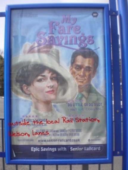
Just recently, I noticed some posters which had been put up around my local town centre by the town council. These were advertising a senior citizen’s concessionary RailCard, part of the public transport infrastructure. I don’t know who the designer is, but hat’s off to him or her for innovation!
What made me stop, and what made this poster design achieve a worthy post on my blog, was the innovative design concept of using famous Hollywood movie titles. ‘My Fair Lady’ was a musical released in the 1950s by producer Gabriel Pascal. Using related imagery and editing the title to read ‘My Fare Savings’ keeps the relevancy of the original movie-title, yet also sells the product it is advertisng – rail cards.

My Fare Savings
I had noticed these a few weeks ago, and I’m kicking myself for not posting earlier because there was actually another one called ‘Honey I Shrunk The Fares’. This was in the style of the famous Rick Moranis movie ‘Honey I Shrunk The Kids’, but I didn’t get a picture of it, unfortunately.
I think this design works because people are already familiar with movie posters and the titles used. Being innovative with the title and keeping it related to the original can really grab people’s attention because it may even be a favourite movie of theirs! If you’re thinking of creating a similar design, here’s some tips to get the best effect:
1. Use ‘Portrait’ Layout Instead Of ‘Landscape’
The majority of movie posters from the past and present are in portrait layout. Most movie posters are synonymous with this layout, so stick with this to get the same effect.
2. Use The Same (or slightly edited) Image From The Original
To really catch someone’s attention, use the same image from the original movie or poster and edit it if need be. This way, the design is still related to the original poster.
3. Change/Edit The Title Only Slightly By Adding/Editing Certain Words
To be really creative, edit the title so that it fits in well with what your poster is advertising. For best results, keep most of the original movie’s name but change one or two words to make it relevant to your product or service.
4. Get The Fonts Right!
Make sure you use the correct fonts where applicable. For example, the ‘Terminator’ movies title is so easy to spot because of the typeface used. The title font should be the same as the original. Another ‘movie poster type’ font which can be used at the bottom of your designs to add further information is called SteelTongs. This type of font is usually used for movie credits such as ‘Directed by..’ and ‘Starring..’.
5. Add ‘Star’ Reviews
To finish the look, add two (at most) imaginary magazine reviews. You can get as creative as you want here and make up some imaginary magazine names relevant to your product or service. Create five stars, underneath which you can add the one word review relevant to you. Underneath the review word, add your imaginary magazine’s name.
What Do You Think?
Are you a graphic designer too? What’s your take on this design idea? Also, if you do decide to use this style, don’t forget to let me have a peak when you’re done!


just sent you a message on facebook, please reply asap :)